Deliberate motion tells people you know what you’re doing.
ACQ Website development
Led the efforts to rebuild websites for companies acquired by RealManage, a 5-time Inc 5000. company.
Roles
Brand Manager Project Manager Full-Stack Developer SEO Analyst
Direct
Be Original
Templates help you get started, then build out your own ideas.
Direct
Be Thoughtful
Not everything needs to move.
An Established Brand
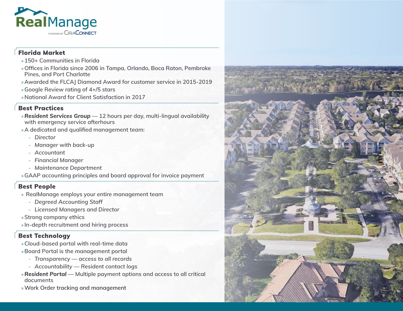
RealManage is an HOA property management firm headquartered in Plano, TX. Since 2004 they have built their legacy through relationship-driven service and world-class technology solutions. The brand was established as tech-forward and approachable - positioning itself as a national brand with a neighborly approach to management services.
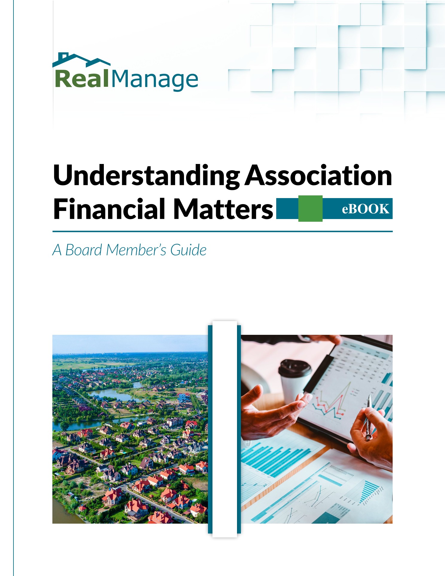
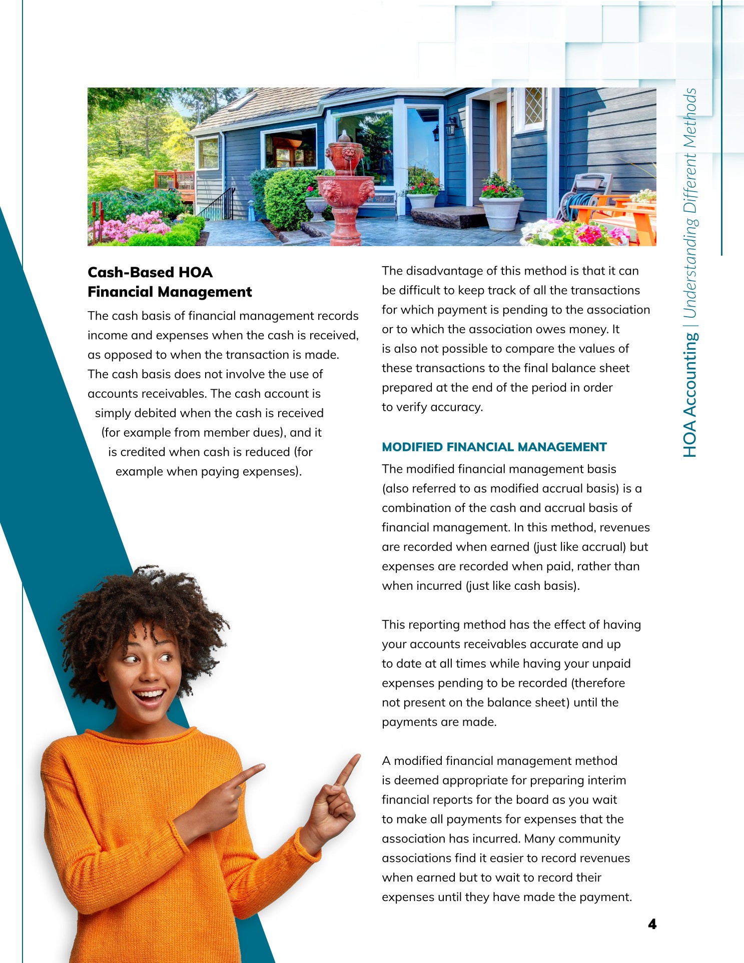
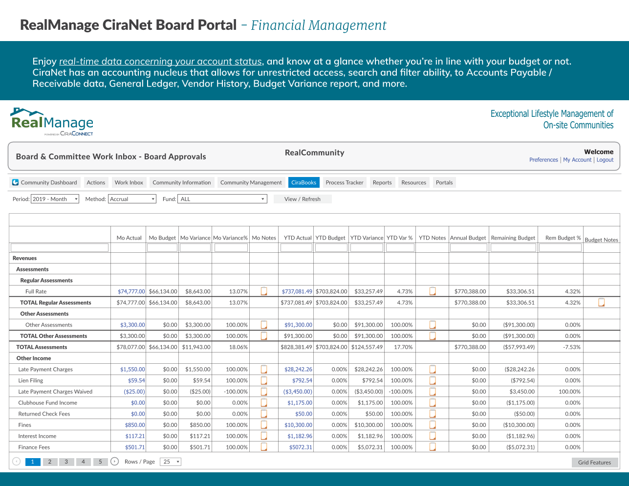
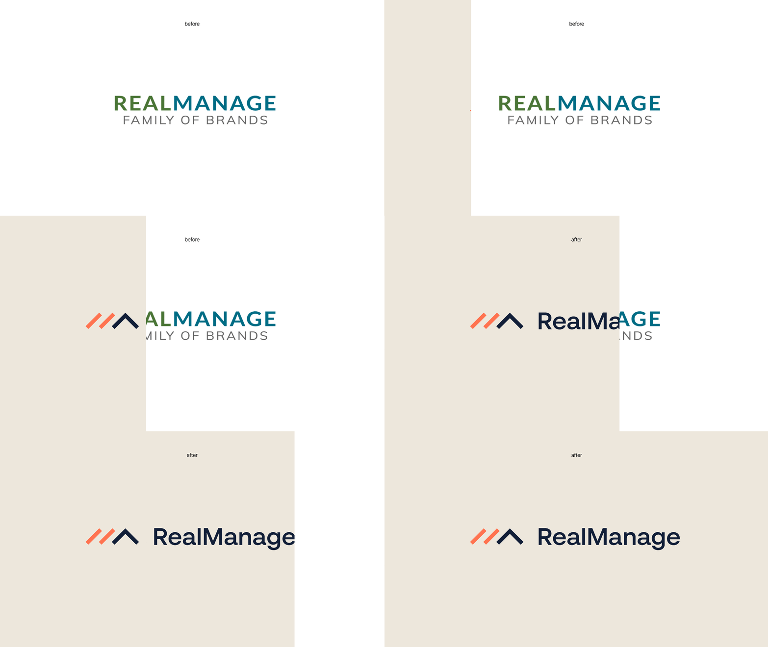
RealManage used the same branding for over 20 years, primarily using white backgrounds and branded assets had varying layouts and compositions. There was a unified look in color, fonts, and content, but not in layout, graphic elements, and headers. From 2017 - 2024 I was the in-house graphic and publication designer, and we operated without established brand standards. It was functional, clean, and professional, but lacked cohesion.
Branding Obstacles
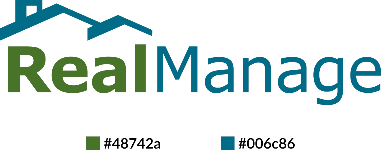
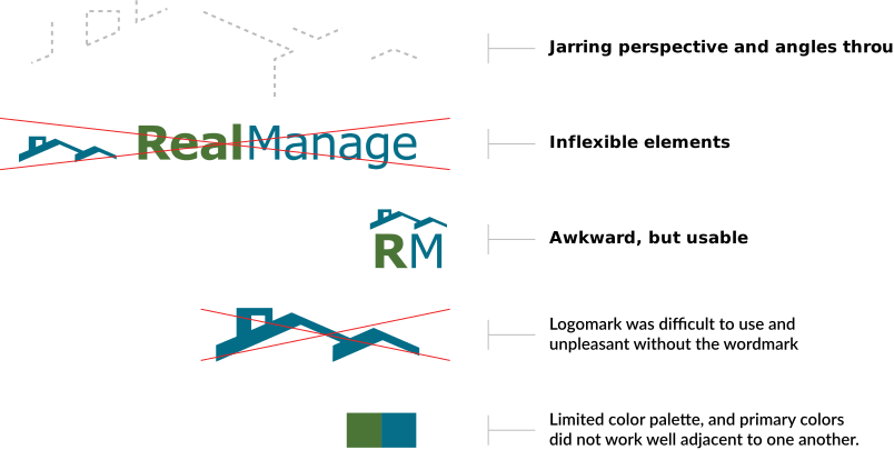
While the logo served its purpose, it also posed several challenges when it came to branding that heavily restricted our usage.
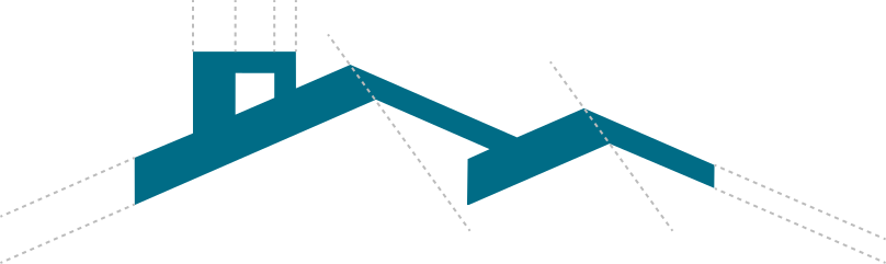
The logomark itself was recognizable, but effectively unusable without the wordmark present. It didn't scale well, and the shape language was a little awkward, full of differing line widths, perspective angles, and just overall balance. The wordmark also used two different sans-serif fonts (a variant of Lato and Tahoma) of different weights. Exacerbating all of this was the fact there were only two established brand colors, they didn't even work well together, and the green color was weird when it wasn't paired with the blue. 95% of the color usage in our marketing material was the blue on a white background, which made the branding very rigid.
SketchDeck's Foundation
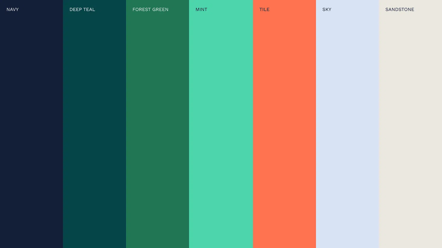
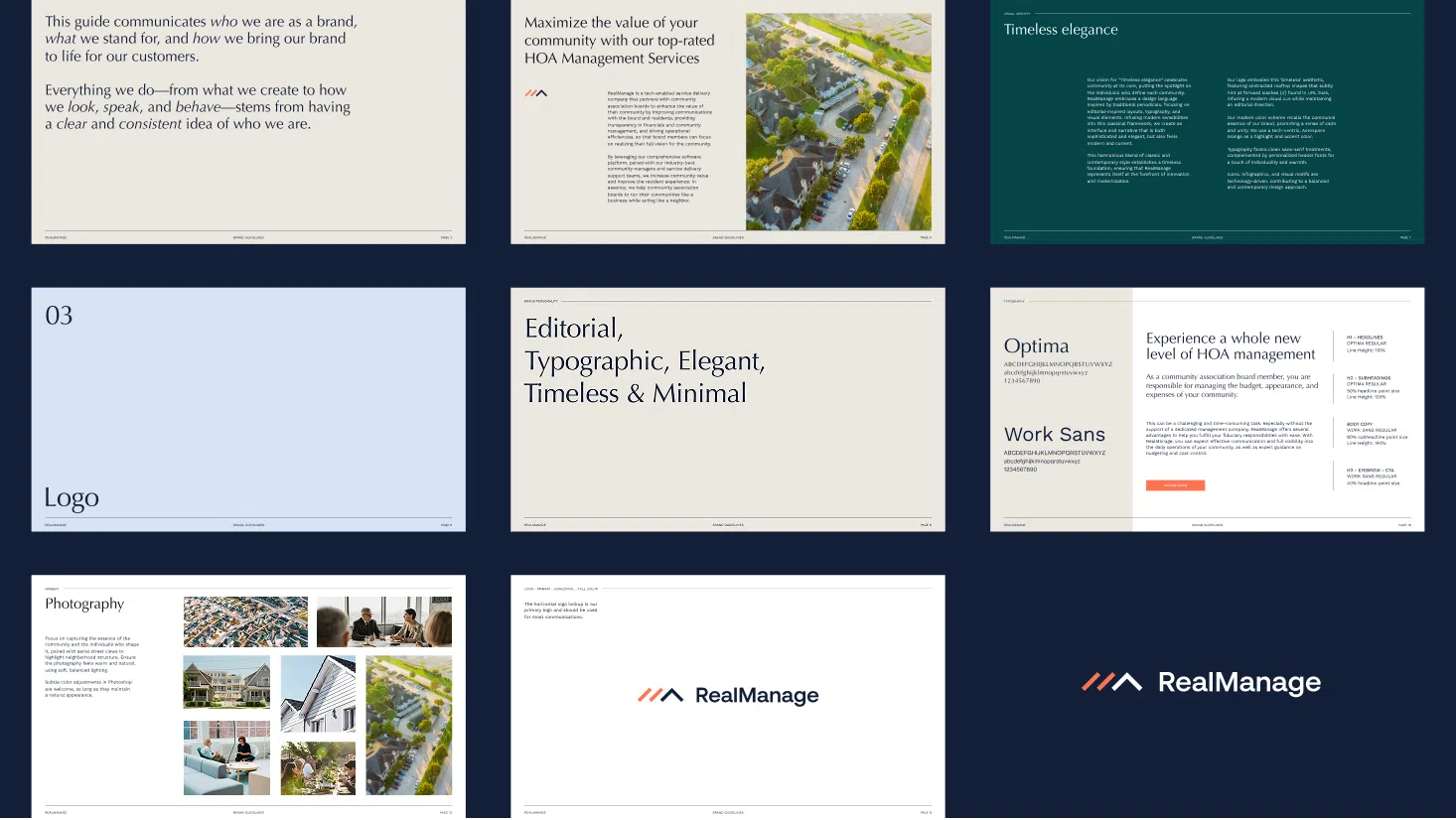
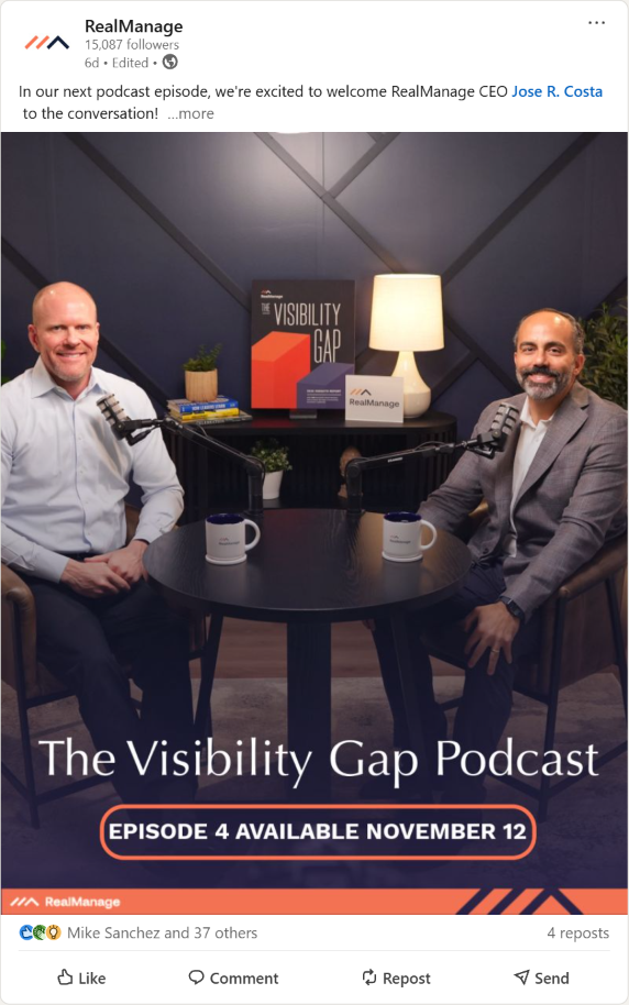
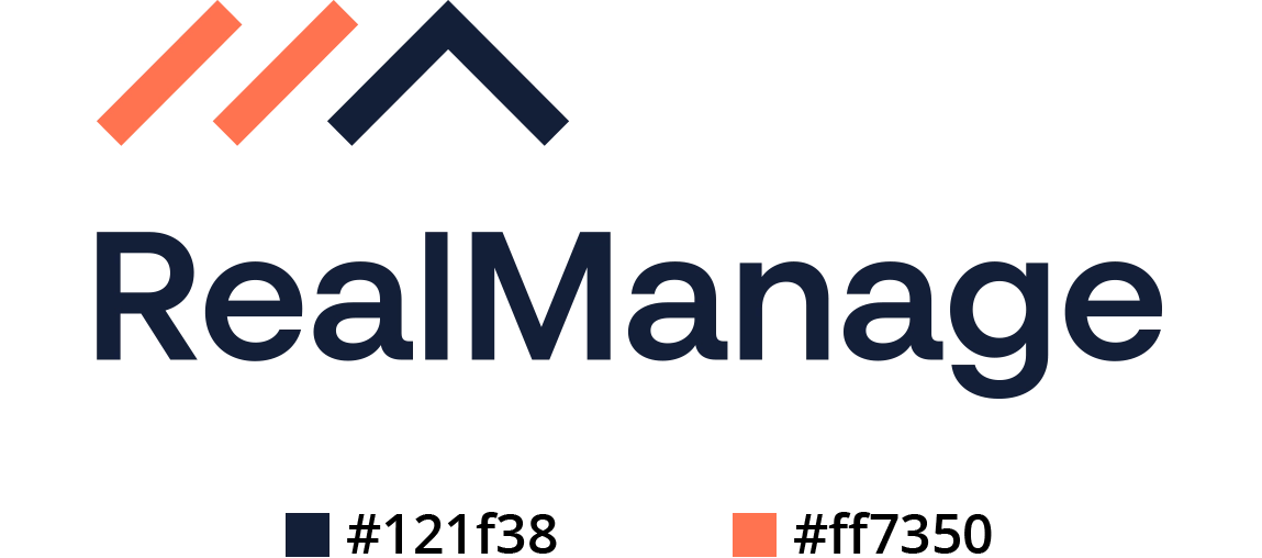
In 2024 we partnered with SketchDeck, a design agency in New York. SketchDeck put together a new brand strategy for RealManage, including a new logo, colors, fonts, and expanded color palette.
The work that SketchDeck did was game-changing for us. We had much more flexibility in how we could use the branding, the colors were fresh, and we had many more tools to use. They delivered in approximately 3 months.
New Challenges
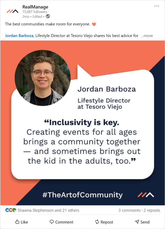
The new tools we had vastly expanded our branding potential, but many of the templates and assets that were delivered missed the mark with the creative direction we wanted to go.
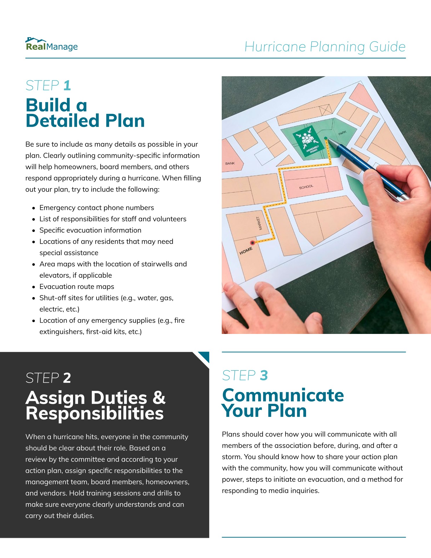
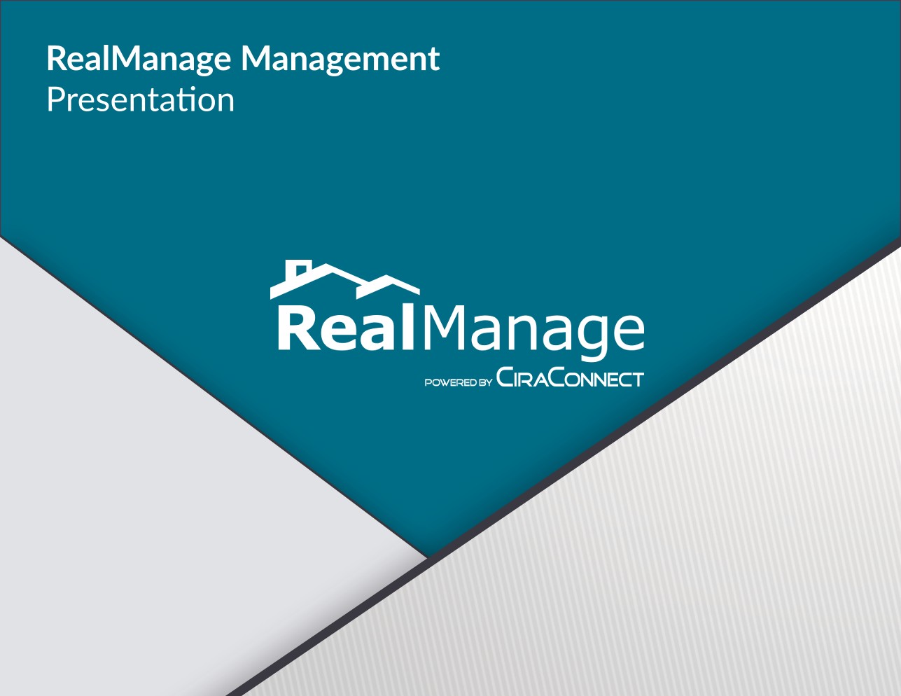
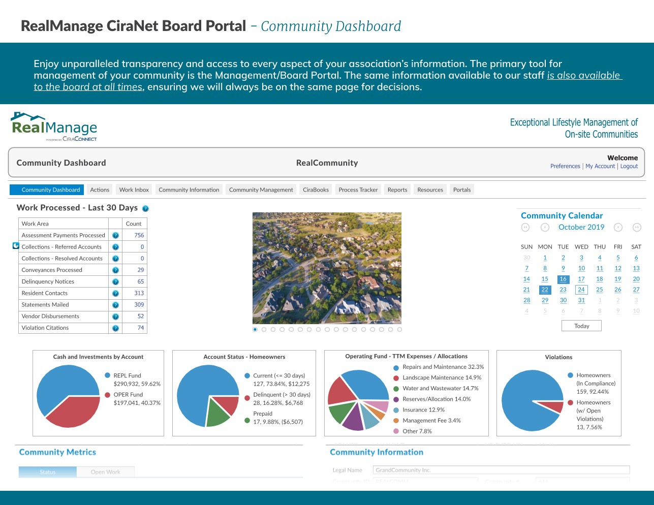
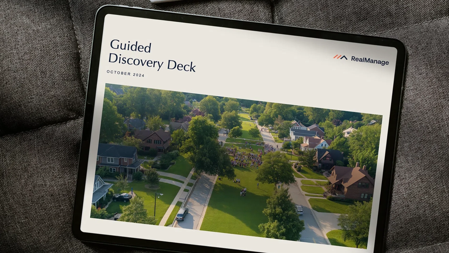
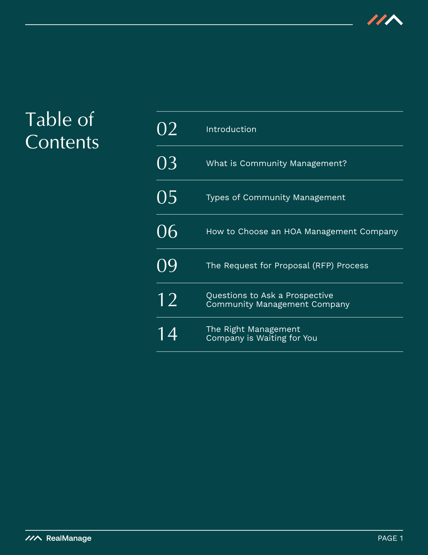
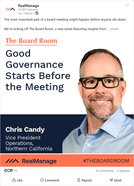
The rebrand strategy lacked layout and composition standards, instead favoring "presentation" type assets that might have been usable in a presentation here or there, but lacked scalability. We needed to establish standards for marketing material and ebooks that varied in content size, format, and usability, not just slide decks for sales presentations.
Creating A Functional Brand
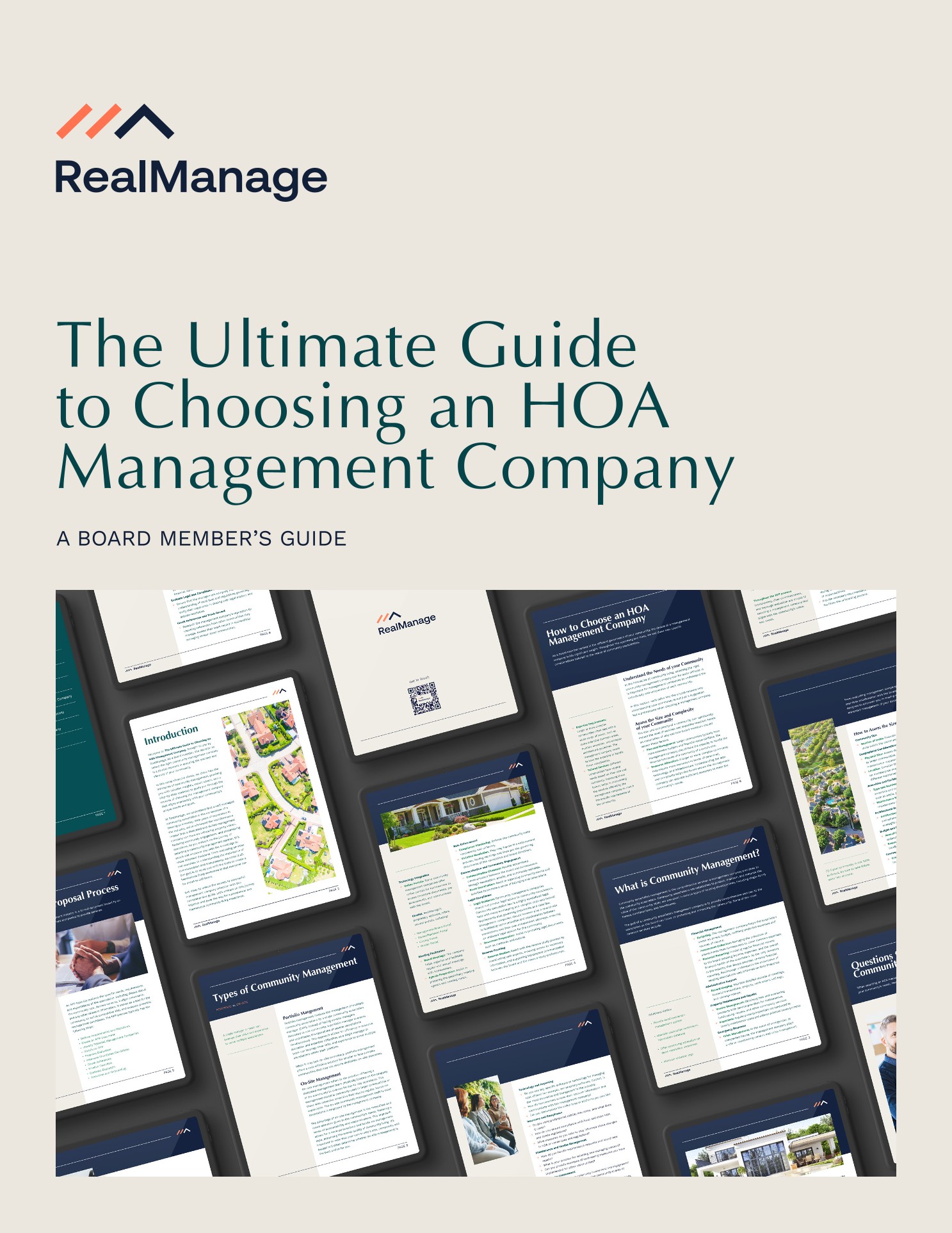
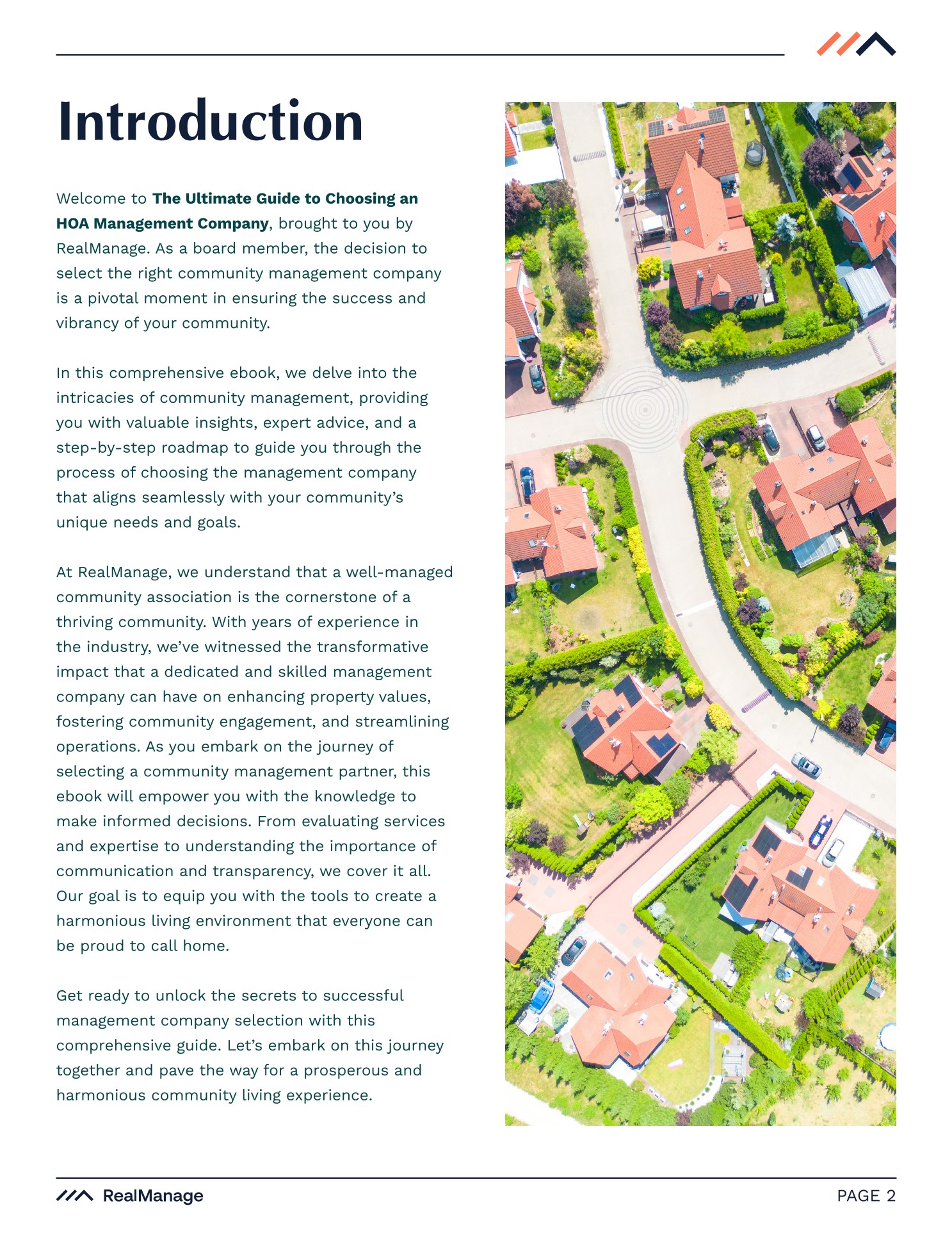
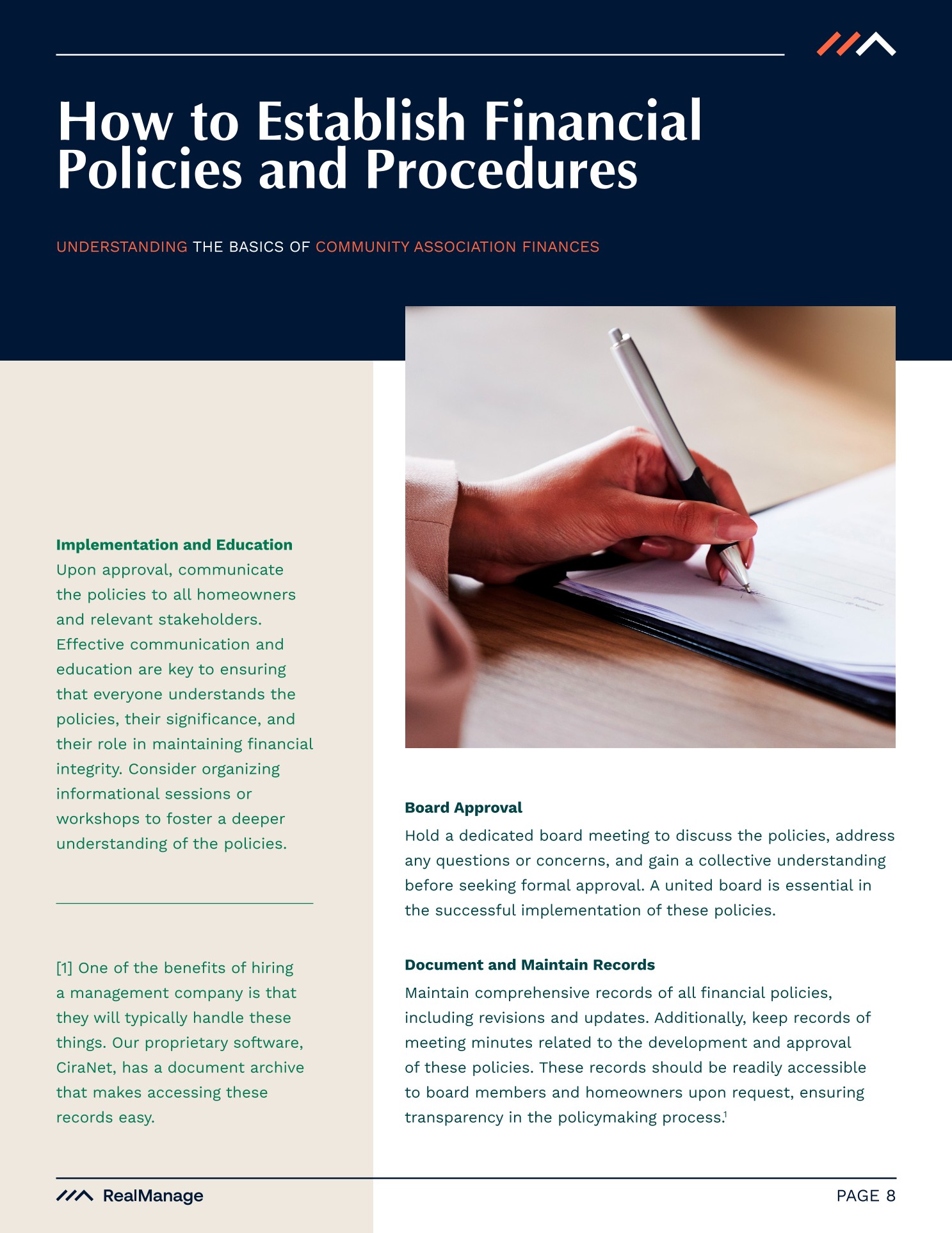
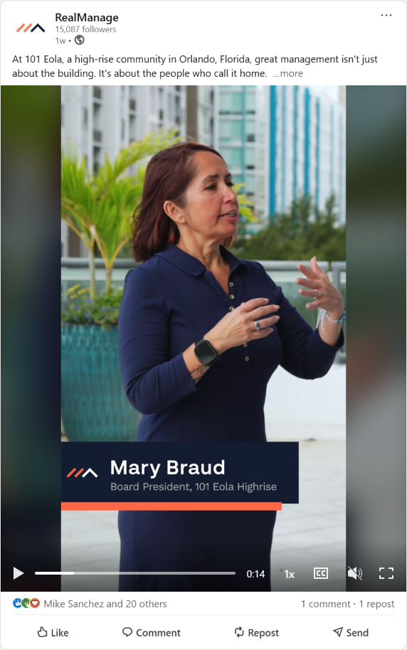
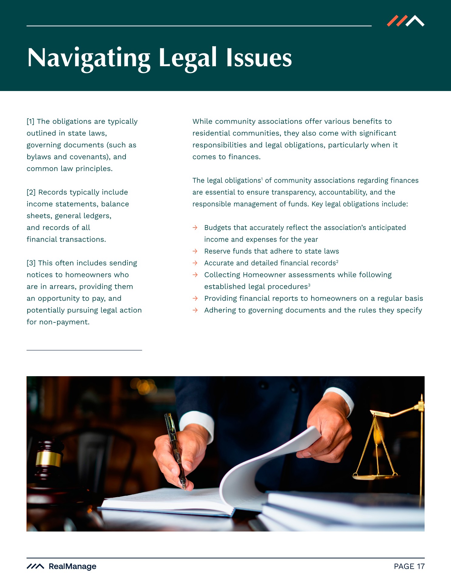
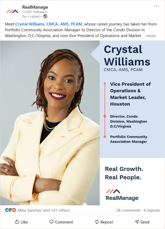
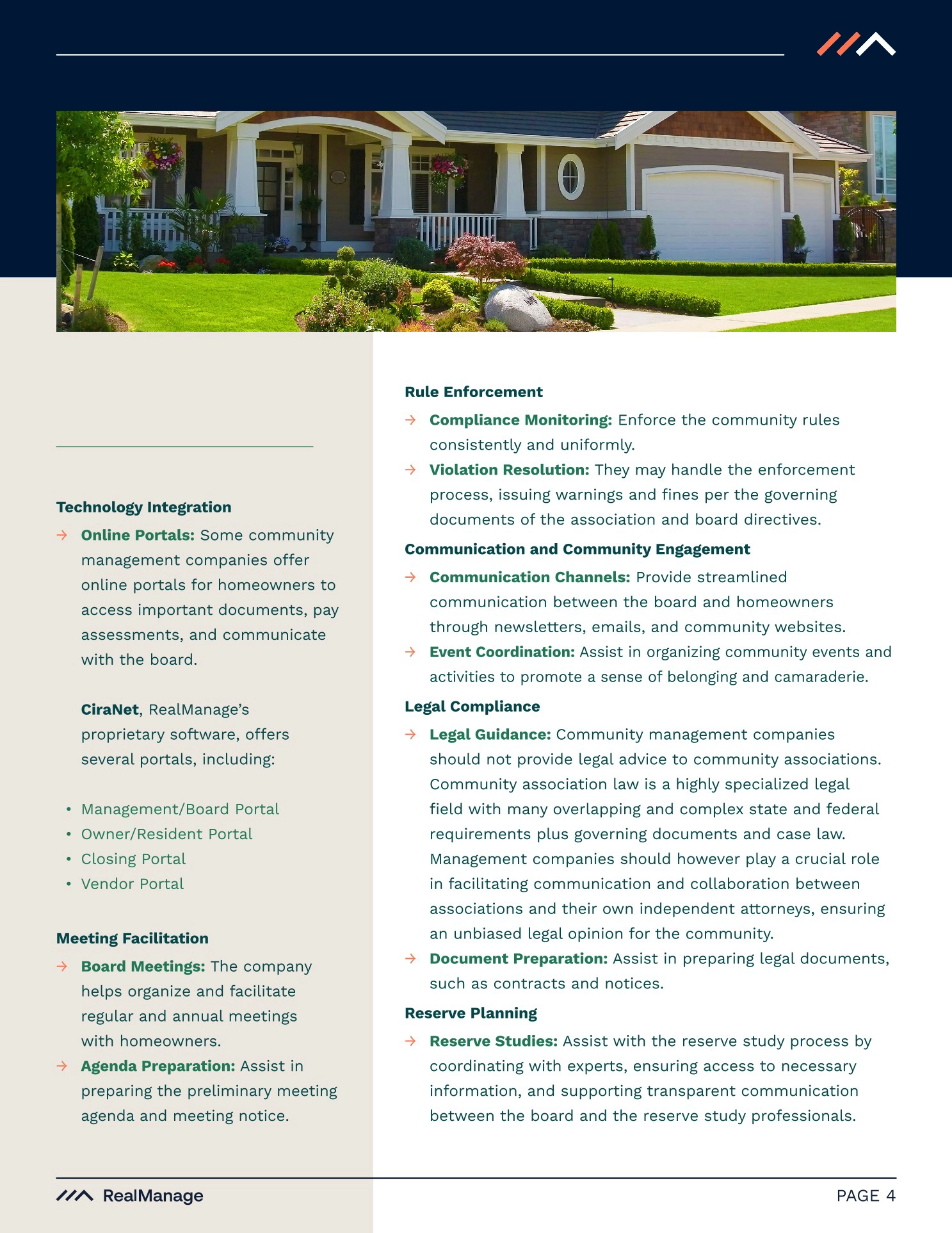
In 2026 we vastly expanded our in-house photography instead of relying solely on stock images and video and it elevated our brand even more. We established spacing and layout standards that were fluid and recognizable while still having an identity. We included sidebars, footnotes, and subheaders and mixed and matched them using color in ways our previous brand stategy restricted us.
While SketchDeck's foundation was crucial, the entire rebrand process took approximately 16 months to truly build and rebrand our library of assets and brand standards. This includes cleaning up vector assets, re-defining the color palette, solidifying the font choices, and standardizing headers, element spacing, and monoline thickness in iconography.